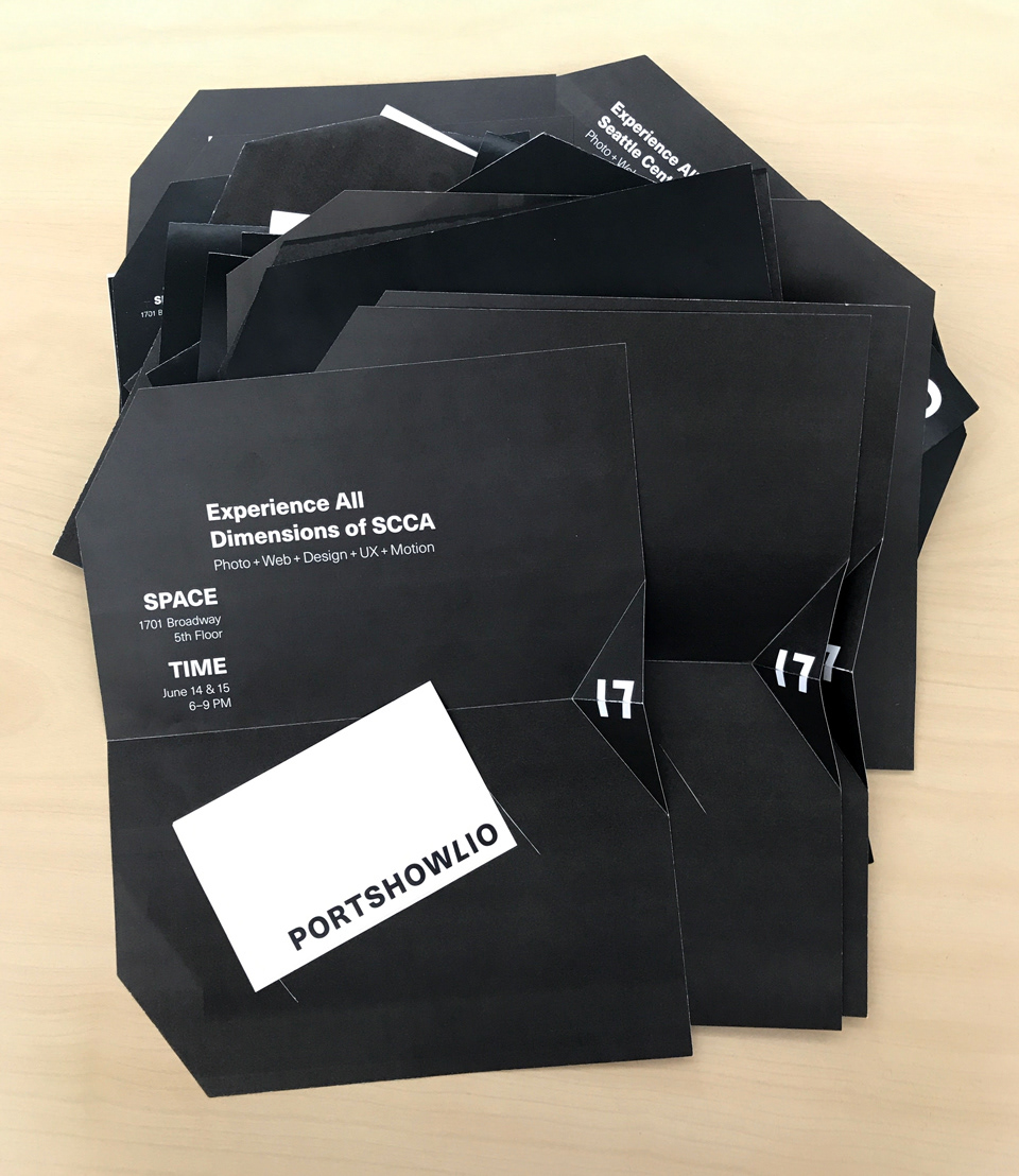
This invitation is for the portfolio show of 2017’s graduating SCCA class. Our branding team established look and feel, typography choices, identity marks, and colors for our theme, “Multidimensional”. Clarita and I used these brand guidelines while designing collateral within the marketing team.
My Role Packaging, Concept, Layout
Tools Illustrator, InDesign
Collaboration Clarita Hinojosa
Front of invitation
Challenge
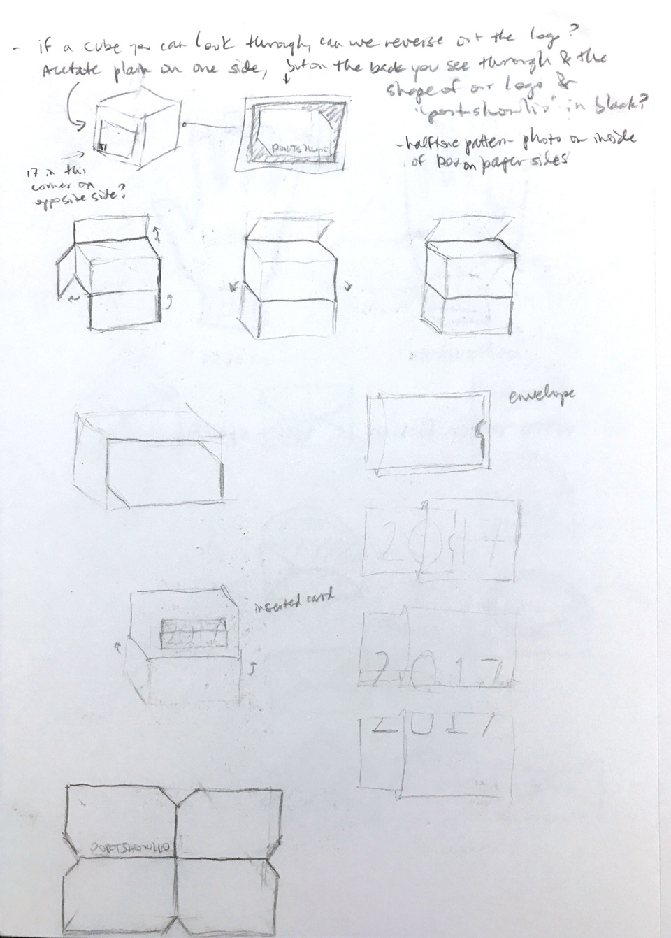
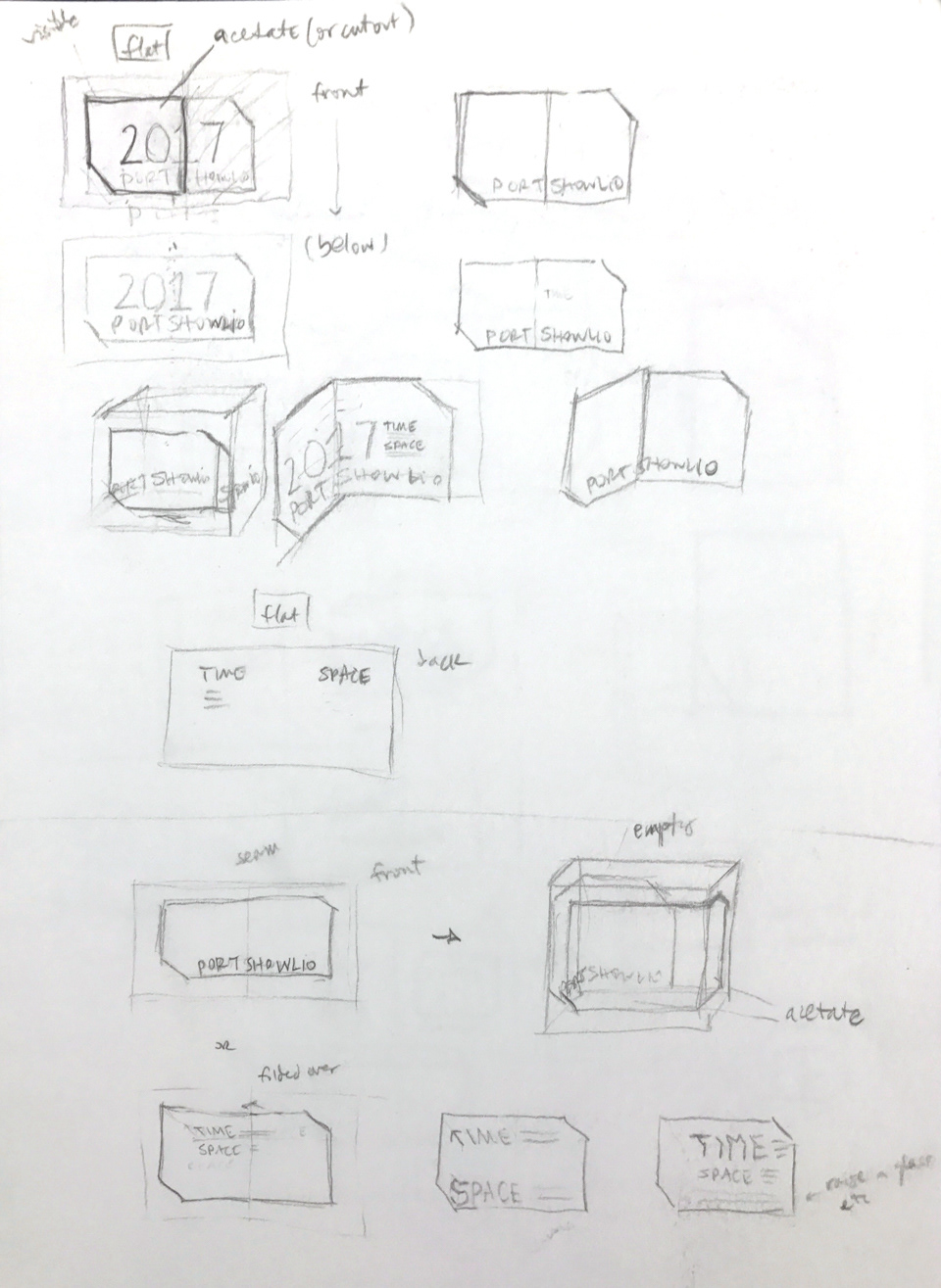
Creating a 3-dimensional surprise aspect within a 2-dimensional object was a priority from the beginning. Working within budget and production parameters was of course necessary, and required research and different proposals for completing the necessary scoring, trimming, and assembly.
Solution
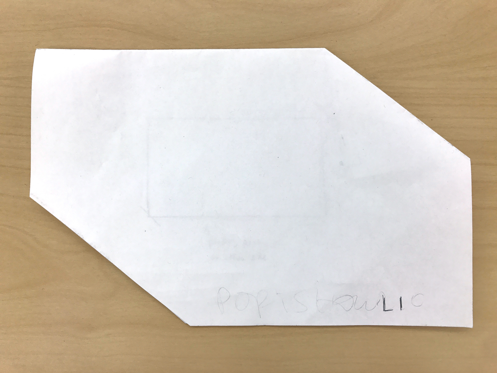
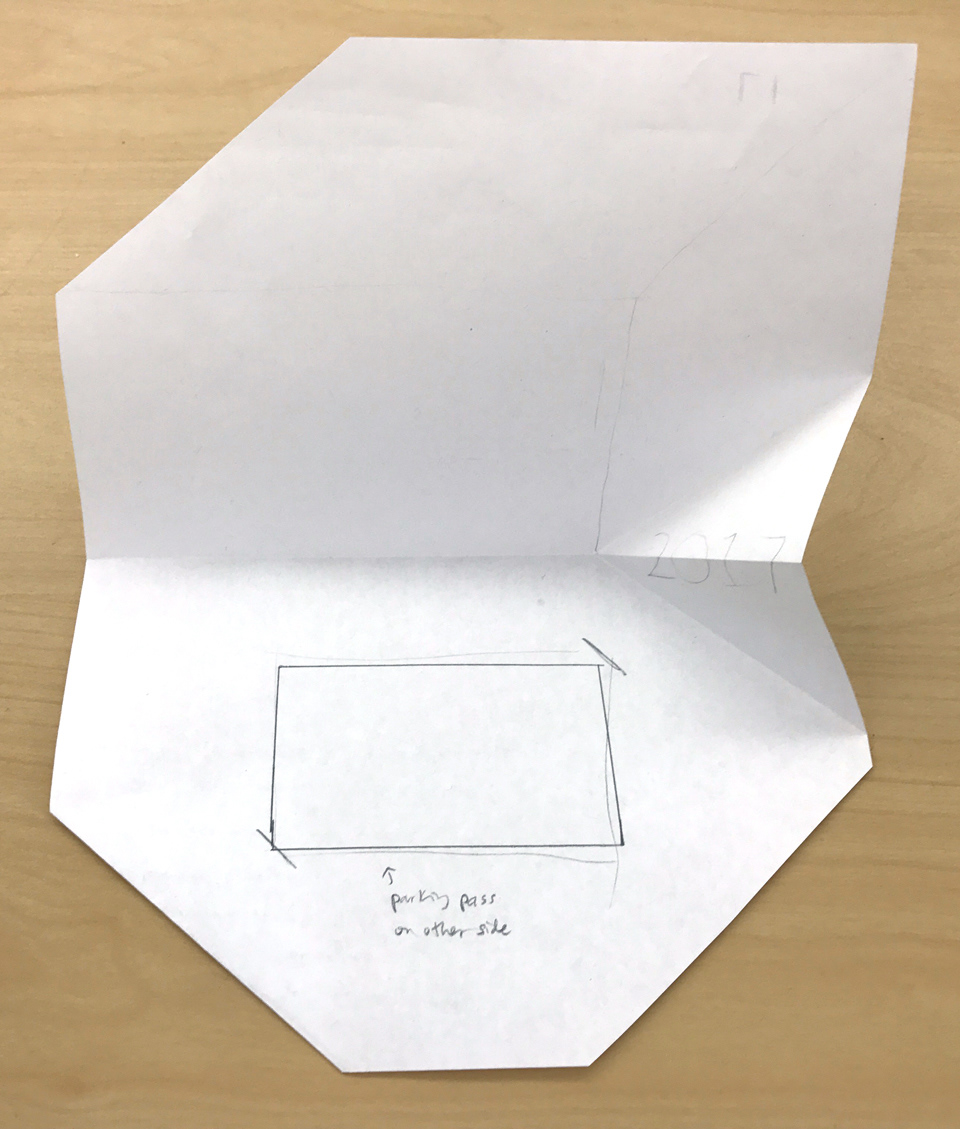
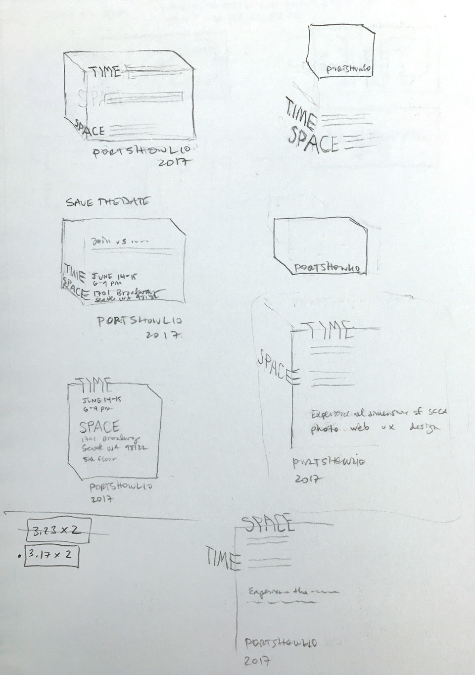
After sketching and experimenting with paper folds the rough design was chosen. When closed, the invitation is our show’s logo. When opened, a hidden fold on the right edge is revealed, showing a pop-up number 17. The white insert on the lower half appears to be the logo in reverse, but when extracted is in fact a two-sided parking pass. A short message and our website is visible underneath, and the website is repeated on the back for good measure.
Invitation when open: with and without parking pass insert
Parking pass, front and back: created by Clarita Hinojosa
Back of invitation
Envelopes with custom inserts
Process
